Showing posts with label Baroque Motifs. Show all posts

Friday, August 3, 2012

Goodbye post #1

I was going to try to make a few last cards with stamp sets that are retiring this month, but I'm afraid Real Life is getting in the way a little, with work and birthdays and other things, so instead I'm going to do what they do on television when the writers are having a break - a Clip Show!

Every so often I will revisit some old favourites - and first up is a stamp set I have loved to bits over the past couple of years:  Baroque Motifs

If you search on the tag for this set, you'll find a whopping 27 posts - it may be I have been a little fond of it.  No, really.

Here are a few of my favourites...


If you click on the pictures you will be taken to the original post which should outline the materials used on each card.  Keep in mind that some of these are several years old and as such, quite a bit of the Stampin' Up! product used has long since retired.

Enjoy the trip down memory lane, and I will be highlighting another retiring stamp set soon!

Saturday, July 7, 2012

Old Favourites


It's been a while since either of these stamp sets came out for a play ... Baroque Motifs, with its gorgeous swirl, really needs more air time, and Pocket Silhouettes with its cute little bunches of leaves.  I was inspired by this card over at Splitcoast Stampers (sooo much inspiration) and as always, ended up with something that wasn't much at all like the original - or, for that matter, anything much like what I had pictured in my head as I was creating *sigh*.

Now, can you see the mistake?  Here's a closeup for you ... I could have kicked myself when I realised what I'd done, but by that time it was all glued together and I didn't have the patience to try to dismantle it. In my defense, the light in my dining room/stamping area can be kind of dodgy and it was kind of late by the time I got to this step.  I knew I should have stuck with Rhinestone Jewels.

I wish I'd taken the time to curl the little flowers up a tad, as well, to give the whole thing a little more dimension.  Next time :-)


Images © 1990-2012 Stampin' Up!®

Supplies used:
 

Stamp(s): Baroque Motifs, Pocket Silhouettes

 Ink: Old Olive, Lucky Limeade, Melon Mambo
 Cardstock: Old Olive, Pretty in Pink, Whisper White, Melon Mambo
Other: Boho Blossoms Punch, Old Olive 1/4" Grosgrain Ribbon, Metallic Brads, Beautiful Wings Embosslit


Thursday, August 11, 2011

Cutout Butterflies

A couple of months ago, I attended Stampin' Up's annual convention here in Melbourne. One of the highlights of convention is seeing fellow demonstrators present a Workshop Wow on stage - they are all so clever, and we always come away with some nifty little trick to share with out customers.

Kirsty Brown showed us a stunning way to use our Beautiful Butterflies Sizzix die. I would try to explain it, but a picture would do the job way better. Here's my take on her nifty technique:


And a closeup:

I'm not sure if it shows up in the photo, but I spritzed the Bashful Blue butterfly with a Frost White Shimmer Paint spray after embossing it.

Once you have the positioning correct, these double cut butterflies are a snap to make - just ask the ladies I taught it to the other week!

Supplies used:
Stamp(s): Baroque Motifs, Vintage Vogue
Ink: Pear Pizazz, Concord Crush
Cardstock: Conford Crush, Pear Pizazz, Whisper White, Bashful Blue
Other: Beautiful Butterflies Bigz Die, Finial Press Em3/16" Corner Rounder, Basic Rhinestones

Sunday, June 19, 2011

Another Butterfly

I know, I really need to get off this butterfly kick, but this is just so much fun! Here we have yet another butterfly easel card, this time in Crumb Cake and Rich Razzleberry (how awesome is this combination of colours?).

This time I've blinged these up a little with rhinestones - love these things *g*.

Supplies used:
Stamp(s): Baroque Motifs
Ink: Rich Razzleberry
Cardstock: Crumb Cake, Rich Razzleberry
Other:
Beautiful Butterflies Bigz die, Vintage Wallpaper Embossing Folder, Basic Rhinestones

Saturday, February 6, 2010

Butterfly Prints

When I sat down to make a card last night, this is not what I had in mind. In my head it was mostly white with butterflies flying across, perhaps punched out with the Butterfly Punch (from the current Summer Mini Catalogue) and glued on.

Very stark and simple.

What I came up with was this ... and I can't even tell you how it happened. The butterflies were originally in the centre of a larger sheet, which would have filled most of the front of an A6 card, but somehow I trimmed it a little here, a little there and ended up with what you see here.

Anyway, I like it.

A word of warning ... if you are planning on buying this set, or already own it, you will find that a Stamp A Ma Jig comes in handy when you're adding the body of the butterfly (a separate, tiny stamp). Nothing worse than having everything stamped just so and messing up at the very last minute when you add the final details!

Images © 1990-2010 Stampin' Up!®

Supplies used:
Stamp/s: Butterfly Prints (Summer Mini Catalogue), Baroque Motifs
Ink: Ruby Red, More Mustard, Pumpkin Pie

Cardstock: Ruby Red, More Mustard, Pumpkin Pie,
Whisper White
Other: Eyelet Border Punch, Stamp A Ma Jig

Friday, November 27, 2009

What have I been working on ...?

Well, mostly these. Okay, so there's only four cards here, but what you can't see is the other 96 which I made recently (with the help of Sharon - thanks Sharon!).

My day job is for a small company which supplies raw materials to label printers. It has become something of a tradition that we send out handmade cards to our customer base (which all began when I first started there and the boss found out I was a cardmaker). At first it was a pretty easy task, but somehow we gathered more customers over the years and I'm wondering what monster has been created LOL.

Anyway, this year Sharon and I put our heads together and came up with this design (which is supposed to look kind of like a branch of a Christmas tree with baubles - or a pleasing abstract design, whichever you like), and we decided to do four different colourways so as not to drive ourselves insane doing 100 cards in the exact same colour scheme.

I like to think that our customers appreciate the effort - we have had some lovely feedback from them in past years, and when printers are liking your work as a cardmaker, you must be doing something right!

Images © 1990-2009 Stampin' Up!®

Supplies used:

Stamp/s: Baroque Motifs, Always, Best Yet (hostess)
Ink: Card 1 - Old Olive, Rose Red; Card 2 - Pale Plum, Elegant Eggplant; Card 3 - Baja Breeze, Not Quite Navy; Card 4 - Gable Green, Taken with Teal

Cardstock:
Card 1 - Old Olive, Rose Red, Whisper White; Card 2 - Pale Plum, Elegant Eggplant, Whisper White; Card 3 - Baja Breeze, Not Quite Navy, Whisper White; Card 4 - Gable Green, Taken with Teal, Whisper White
Other: Large Oval Punch, Scallop Oval Punch

Friday, September 4, 2009

A little too pink, even for me!

I have to try this technique again, but in a different colour. I came across the original (shown here - isn't it lovely?) a few weeks ago, and finally got around to making my own interpretation of it recently.

I have stamped the big swirl from Baroque Motifs randomly on a piece of Regal Rose cardstock with Regal Rose ink. Then using the floral stamps, I added contrast using Whisper White Craft ink. Sponging the edges of the layer in Whisper White finished it off nicely, giving the main piece a little contrast from the base card, also Regal Rose.

And because it looked a little bare, I added the strip of punched Whisper White cardstock down the side; I do wish, however, that I'd thought of that before I stuck the card together ... had to do a little encouraging to get it to stay LOL.

(PS I have no idea what is going on with my camera ... the card is not an odd bowed shape at all, the edges are perfectly straight, and yet this picture shows it all skewed. Must've had gthe camera on the wrong setting (again) - I hate my new camera ... *sigh* ... should've bought another Canon instead).

Images © 1990-2009 Stampin' Up!®

Supplies used:

Stamp set/s: Baroque Motifs, Short & Sweet
Ink: Regal Rose, Whisper White Craft
Cardstock: Regal Rose, Whisper White

Other: Small Oval Punch, Large Oval Punch, Scallop Oval Punch, Eyelet Border Punch, Whisper White 1/4" Grosgrain Ribbon

Wednesday, July 29, 2009

More Cards from the Show

I put a few cards up for sale on our stand at the recent Craft & Quilt Fair. Some are posted here, and I thought I'd share some more with you. These are the remainder of the One Sheet Wonder I created for this purpose.


Images © 1990-2009 Stampin' Up!®

Supplies used:

Stamp set/s: Baroque Motifs, Inspired by Nature, Best Yet (Hostess Set), Weathered, Simply Said

Ink: Not Quite Navy, Baja Breeze, Elegant Eggplant, Pale Plum
Cardstock:
Not Quite Navy, Baja Breeze, Elegant Eggplant, Pale Plum, Whisper White
Other: Wide Oval Punch, White 1/4" Grosgrain Ribbon, Mat Pack, Uniball White Gel Pen, Scallop Circle Punch, 1-3/8" Circle Punch, Friendly Words Jumbo Wheel

Tuesday, July 28, 2009

Dusting off the cobwebs

Okay, so it's been a while since I updated ... not as bad as some (not looking at anyone in particular but you know who you are) but still.

I have an excuse! We were busy preparing for the Craft & Quilt Fair last weekend, which went really well (hi again to everyone who came past on the Saturday evening and Sunday when I was there!).

I have yet to photograph the One Sheet Wonder display I sneak peeked a while back, which got some lovely comments during both Paperific and the Craft & Quilt Fair, but I hope to get to that this week.

In the meantime, here are some of the cards I put out for sale ... some sold, although I haven't checked to see which ones yet (but it was very exciting, as I've never made cards for sale before). Yes, I have used the One Sheet Wonder template yet again, because it is a great way of making a bunch of cards all at once - once you get the hang of it you can put the lot together in only a few hours.

This is a beautiful colour combination ... it turns out that one of the new In Colors for this year, Baja Breeze, coordinates wonderfully with Not Quite Navy, and I have rediscovered Elegant Eggplant, a dark purple which goes great with Pale Plum.


Images © 1990-2009 Stampin' Up!®

Supplies used:

Stamp set/s: Baroque Motifs, Oval All, Best Yet (Hostess Set), Weathered, Upsy Daisy, Wonderful Favourites

Ink: Not Quite Navy, Baja Breeze, Elegant Eggplant, Pale Plum
Cardstock:
Not Quite Navy, Baja Breeze, Elegant Eggplant, Pale Plum, Whisper White
Other: Large Oval Punch, Scallop Oval Punch, Large Tag Punch, Horizontal Slot Punch, 1-1/4" Square Punch, 1-3/8" Square Punch, White 1/4" Grosgrain Ribbon, Friendly Words Jumbo Wheel, So Swirly Jumbo Wheel

Wednesday, April 22, 2009

Counting down to Canberra

The highlight of the Stampin' Up! year would have to be the annual Convention, held in a selected capital city each year around this time of year. This year it's in our nation's capital and it's next week (eek).

At most papercrafting gatherings, it is a tradition for attendees to swap creations, and of course a convention hall filled with Stampin' Up! demonstrators is no exception. I have even managed to get my act together enough to prepare swaps (for me this is pretty momentous, generally I'm not organised to make more than one of anything) (I make an exception for these events though!).

This time around I have gone with a couple of different designs, because when I started I didn't have any new stuff, then I got excited about this new set Upsy Daisy and had to do something with that as well. And so I didn't get too bored I ran with a few different colourways on the Upsy Daisy card (you can see two of them here) (okay, there was an ulterior motive - I ran out of Apricot Appeal cardstock and had to use an alternative colour as the base so played around with the other colours*g*).

So here's my swaps. I like them. But I'll be happy to get rid of them all because that means I'll have some lovely new things to look at when I get back from Canberra.

Images © 1990-2009 Stampin' Up!®

Supplies used:

Stamp set/s: (Cards 1 & 3) Upsy Daisy; (Card 2) Baroque Motifs, En Francais
Ink: (Card 1) Real Red, Pixie Pink, Apricot Appeal; (Card 2) Pixie Pink, Close to Cocoa, Chocolate Chip; (Card 3) Ruby Red, Pumpkin Pie, More Mustard, So Saffron
Cardstock: (Card 1) Apricot Appeal, Real Red, Basic Black, Whisper White; (Card 2) Close to Cocoa, Pretty in Pink, Chocolate Chip, Glossy White (Card 3) Pumpkin Pie, Ruby Red, Basic Black, Whisper White

Other: (Cards 1 & 3) Stampamajig, 1-3/8" Square Punch, Stampin' Sponges; (Card 2) 1-1/4" Circle Punch, 1-3/8" Circle Punch, Scallop Circle Punch, Stampin' Sponges

Can't wait till next week!

Sunday, March 15, 2009

Attempting a Card Sketch Challenge

So this challenge was put out quite some time ago by Makeesha Byl ... I don't usually do these challenges, but was feeling a little short on creative inspiration by myself and needed the shot in the arm to get going.

Turned out to be a lot harder than I'd thought!

Usually when I make a card, I don't really have a particular idea in mind as to how it will come out. I'll pick a colour combination, or a stamp set, and see what happens. So to start at what I would consider the finish was tricky!

It took a while, but I ended up with something I actually liked. I figured if I was going to do this, the challenge was in using the sketch so I'd better make the colours easy, which is why this particular card is Pretty in Pink, Chocolate Chip and Very Vanilla - you can't go wrong with this combination! And using Baroque Motifs was also a little bit of a cheat, because it's pretty hard to make an ugly card with this stamp set *g*.

Supplies used:

Stamp sets: Baroque Motifs, En Francais

Ink: Chocolate Chip, Pretty in Pink

Cardstock: Chocolate Chip, Very Vanilla, Pretty in Pink

Other: Scallop Circle Punch, Mat Pack, Cutter Kit, Stampin' Sponges

Sunday, November 23, 2008

Just playing

Sometimes it's hard to find the motivation to stamp, so when you do you have to make the most of it. The weather in Melbourne this weekend has been what can only be described as average (well, less than average at times) so I dragged out some stamps to see what I could come up with.

Sadly I can't show you some of my new creations! But with the new Summer Mini catalogue due for release on December 1, you don't have too much longer to wait before I can post samples. I can't wait to show you - you're gonna love it!

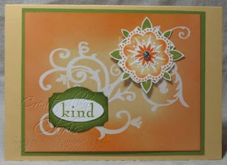
But for now, let's take a look at an old favourite which I've been revisiting lately - Baroque Motifs. I saw a card somewhere made with these colours and thought I would give it a go - warm colours aren't something I'm usually comfortable with, but the sample was so pretty I had to try.

Here I have stamped the swirl onto white gloss card with Versamark, then clear embossed. After it cooled, I brayered So Saffron all over the white, and sponged Pumpkin Pie around the edges.

I used the Rock n Roll technique on the floral medallion stamp, and as a finishing touch I tarted up a brad with some Dazzling Diamonds glitter (this is so easy - attach a glue dot to the head of the brad - they're exactly the right size! - and dip in glitter!). Here's a closeup ...

This whole thing looks pretty cool in real life - you can believe that I patted myself on the back when I was finished!

Images © 1990-2008 Stampin' Up!®. Contact me if you wish to order any of the supplies used to make this card.

Supplies used:

Stamp sets: Baroque Motifs
Ink: Old Olive, Pumpkin Pie, So Saffron, Versamark

Cardstock: Whisper White, Gloss White Cardstock, So Saffron, Old Olive, Pumpkin Pie

Other: Designer Label Punch, Small Oval Punch, Clear Stampin' Emboss Powder, Vintage Brads (black), Mini Glue Dots, Dazzling Diamonds, Stampin' Sponge

Tuesday, November 18, 2008

Christmas Inspiration

I was blurfing (yes, of course you know what that means ... you're doing it now! Blog surfing, that is) earlier and decided to visit the very talented Marelle Taylor's blog over at thINKspot. Her stuff is simply gorgeous *sigh*. Anyway, I was taken by the card on this post and, because I am actually supposed to be doing something completely different, ended up making this instead.

This is just so easy it's almost embarrassing *g*.

I have a small stash of old copper coins and 1c pieces are the exact right size for this technique. Once I run out of 1c bits, the cards will become 8c dearer to make after I switch to using 5c pieces.

I wonder if I could churn a few of these out for my family Christmas cards this year ...? These spinner cards are so much fun to play with, almost hypnotic. Try one and see!

Images © 1990-2008 Stampin' Up!®. Contact me if you wish to order any of the supplies used to make this card.

Supplies used:

Stamp sets: Baroque Motifs, Party Punch (hostess)
Ink: Old Olive, Real Red

Cardstock: Whisper White, Old Olive, Real Red

Other: Word Window Punch, 1/2" Circle Punch, 1" Circle Punch, 1-1/4" Circle Punch, Scallop Circle Punch, Scallope Edge Punch

Thursday, October 2, 2008

An underappreciated colour - Soft Sky

I have been playing with Soft Sky a little bit lately, and while I didn't think much of it at first, it has started to really grow on me.

As you can see here, it works really well with browns, in this case Creamy Caramel.

Next I might try it with Sage Shadow and Perfect Plum (a la this card) - who knows? It might just work.

Images © 1990-2008 Stampin' Up!®

Supplies used:

Stamp sets: Baroque Motifs
Ink: Soft Sky, Baroque Blue, Creamy Caramel
Cardstock: Soft Sky, Creamy Caramel, Whisper White

Other: Scallop Punch, Cropadile, Eyelets, Dimensionals

Monday, September 15, 2008

Catching up

With one thing and another, I've not really found time for stamping or writing this week ... just stuff getting in the way, but that's how it is I guess *shrug*.

To make up for the lack of posts lately, here are pictures of the cards we made at a workshop I ran over the weekend (waves to Melita and her friends - thanks for a fun afternoon!).

Firstly a Christmas card ... well, after all it's only 3 and a bit months away, so now is the best time to start! I forgot to include a brad in the workshop sample (oops, sorry guys) but otherwise it's as seen here.

We used my favourite Purely Pomegranate and another of SU's 2007/08 In Colors, Wild Wasabi. The green of Wild Wasabi is a little more vibrant than seen here, and between this and the Pomegranate, they take the traditional red/green Christmas colour combination and give it a bit of oomph *g*!

Do the sponged edges of the green layer show up? We did that to give the card a little more depth.

Images © 1990-2008 Stampin' Up!®

Supplies used:

Stamp sets: Season of Joy
Ink: Purely Pomegranate, Wild Wasabi
Cardstock: Purely Pomegranate, Wild Wasabi, Whisper White

Other: So Swirly Stampin' Around Jumbo Wheel & Handle, 1-1/4" Circle Punch, 1-3/8" Circle Punch, Stampin' Dimensionals, Stampin' Sponges

The other card we made was similar to the one posted here, except that I didn't have the butterfly from Priceless (because I didn't get the stamp set for my very own until today - at last, I finally got around to buying it for myself!), so we used the side-on butterfly from Garden Whimsy instead.

I also substituted the Regal Rose cardstock and ink for Cameo Coral (not enough of the original colour cardstock on hand - also now rectified with the order I received today *g*). The colours are similar enough to be interchangable here, but when you have them side by side they are very different (if that makes sense ...?). Perhaps you need to see them to compare.

This card is quick and easy but also has a Wow factor to it. Well, that's what I think, anyway *g*.

Images © 1990-2008 Stampin' Up!®

Supplies used:

Stamp sets: Baroque Motifs, Garden Whimsy, Warm Words
Ink: Cameo Coral, Old Olive
Cardstock: Cameo Coral, Old Olive, Whisper White

Other: Basic Black Stampin' Write Marker

Wednesday, August 20, 2008

Something elegant ...

... well, I think it is, at least. I was browsing through the galleries at Splitcoast Stampers (as you do) and came across this card ... the colours and layout appealed to me and I had to have a go at something similar.

I had also been looking at samples where the swirly flourish had been stamped with Versamark and clear embossed, so I was trying that out as well ... you can't really see it in the scan.

(I would have taken a photo to post here, but I've let my daughter take the camera to camp (what a good mum I am) and of course, the minute it's out of the house I need it. I couldn't even take a photo of the bus as she was leaving this morning *sniff*.

Sorry about that, I got sidetracked *g*. She is probably having a ball right now, but it's her first time at camp and it's just kind of quiet here without her)

Now, you're looking at that scan and thinking "where did that ribbon come from? Chris only uses SU stuff in her blog and they don't carry ribbon in that colour!" Well, you probably weren't (unless you know your SU catalogue inside out) but now that I've mentioned it ... I wanted ribbon to match the cardstock, but didn't have the right shade, so I made my own! I mixed half a dozen drops of River Rock reinker with a tiny bit of water then swooshed a piece of white grosgrain ribbon around in the mixture until it soaked up all the colour. So cool.

Reinkers are a must - I am making it a policy to always buy the matching reinker when I buy a new pad lately. And there's a lot of colour in a little bottle!

I haven't forgotten that I am meant to post the "full version" of my Plum, Chocolate and Vanilla card ... hopefully tomorrow or Friday. Honest.

Images © 1990-2008 Stampin' Up!®

Supplies used:

Stamp sets: Baroque Motifs
Ink: Versamark, Purely Pomegranate

Cardstock: Purely Pomegranate, River Rock, Very Vanilla
Other: Clear Stampin' Emboss Powder, Embossing Buddy, Whisper White 1/4" Grosgrain Ribbon, River Rock reinker, Large Oval Punch

Tuesday, July 29, 2008

Catching up on some stamping

... well, actually, that is a bit of a fib. These cards were a couple I made a couple of months ago. Given that I haven't had a chance to make anything nice for my blog the past couple of weeks *sigh* nor have I had much in the way of mojo, I thought I would share these with you instead.

Firstly a super-easy layout which was CASEd from somewhere on Splitcoaststampers ... sadly I can't recall whose card it was, but whoever you are - thank you! What a striking idea this is.

Images © 1990-2008 Stampin' Up!®

Supplies used: Garden Whimsy, Baroque Motifs and Warm Words stamp sets, Whisper White and Basic Black cardstock, Basic Black and Purely Pomegranate ink, Large and Small Oval Punches.


And secondly, another CASEd layout, again from Splitcoaststampers - I wish I had remembered to note down whose cards these were :-(

The ribbon's colour is quite washed out in this scan, it is much prettier in real life.

Images © 1990-2008 Stampin' Up!®

Supplies used: Garden Whimsy and Paisley stamp sets, Whisper White, Bordering Blue, Pretty in Pink and Purely Pomegranate cardstock, Purely Pomegranate and Old Olive ink, Pretty in Pink ribbon, Paper Piercing Tool and Mat Pack, Stampin' Sponges.


I haven't forgotten my promises - to upload some cards made with my new stamp sets from the upcoming Mini Catalogue (only a couple more days to go till you too can buy from it, oooooh!) and to upload the One Sheet Wonder cards I displayed at the Craft Show over the weekend. Stay tuned ...

Friday, July 4, 2008

Something a little different

Well, at least the colours on these cards is different ... look, no pink today! I managed to steer away from pink, although the Pale Plum is almost a pinky colour.

Firstly something I wanted to fiddle around with since I saw something similar the other day - almost a "spotlight" technique, but instead of colouring in the focussed image, I simply framed it with black. I like the monochrome effect, although I ended up putting a layer of slightly darker cardstock at the back ... not sure if this helps or not, but the card itself is in danger of falling over, with all those layers!

I wish there was another oval punch inbetween the large and small sizes ... I think that would look pretty nifty in that darker plum colour.

Images © 1990-2008 Stampin' Up!®

Supplies used: Baroque Motifs stamp set, Pale Plum, Perfect Plum and Basic Black cardstock, Basic Black ink, Large Oval Punch, Small Oval Punch.


This next card uses a stamp I've been kind of overlooking since I got this stamp set ... it's a sort of squarish design, kind of plain by itself, but when I saw how it had been used to mimic leaves under a flower, I took a second look at it - I like how it looks kind of like a bouquet seen from above, with leaves framing the flowers.

Loving the colours together too.

For the pale background, I inked up my Baroque Border wheel on my Versamark pad, so the design would be extremely subtle. I love the wheel, but find it can be a little overwhelming at times.

Images © 1990-2008 Stampin' Up!®

Supplies used: Baroque Motifs stamp set, Pale Plum, Perfect Plum, Old Olive and Whisper White cardstock, Pale Plum, Perfect Plum, Old Olive and Versamark ink, Baroque Border Wheel, Crop-A-Dile, eyelet

One more card, only this time I had no hand in making this ... my daughter did this for my birthday the other day. No stamping! I can't believe she's my kid *g*.

I bought myself season one of Get Smart (the original TV series) because a) I've always wanted it and b) it was released on my birthday and if that's not a sign I don't know what is. At last, I can show the kids one of my favourite shows, and so far (three episodes in) they are enjoying it nearly as much as me. However, I think I get more laughs out of knowing what is coming next *g*.

Saturday, June 28, 2008

More pink ...

I tried really hard today to *not* make a pink card, but it just happened that way. I think my mistake was to use green in the first place - it goes so well with pink. Next time I think I will start with a different colour and see what direction it takes me in.

Every month I try to get to our local "stamp club" (well, when I say "local", it's more of a 20 minute drive). This club has been going in various forms for over 10 years now, and is a nice way to get out of the house for the afternoon and see what other people are doing. Half the time I don't get any stamping done, but just chat and look at what everyone else is doing.

Lately I have been trying to be a bit more focussed, however, and here is the results.

[CASEing alert (surely you've seen this acronym before? It means Copy And Steal Everything - but in the nicest possible way, or at least that's how I use it). These ideas aren't mine, but I can't recall where I saw them originally. If you think your card might have been the inspiration for one of these and you don't think I should have it up, please let me know.]

The colours are a little odd on this one, although I tried to alter the hue and saturation somewhat so it looked a little more like the card itself. It does look a little more vibrant in real life. Look, there's that butterfly from Priceless yet again!

I don't know if you can see the row of holes pierced along the bottom of the black panel, just a bit of visual interest and texture there.

Images © 1990-2008 Stampin' Up!®

Supplies used: Baroque Motifs and Priceless
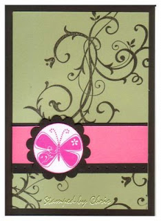
stamp sets, Pretty in Pink, Mellow Moss, Pink Passion, Basic Black and Whisper White cardstock, Pink Passion and Basic Black ink, Paper Piercing tool and Mat Pack, Scallop Punch, 1-3/8" Circle Punch.


I like how this one came out, and it was pretty simple to do. See how the swirl from Baroque Motifs looks like some sort of bramble or wilderness of weeds? Wish I could say I'd thought of that myself.

The trickiest part of this was doing the butterfly's antennae - I inked it up, then used my finger to wipe away the pink on just that part and then inked that bit up with the tip of my black marker. A little fiddly, but well worth it.

Images © 1990-2008 Stampin' Up!®

Supplies used: Baroque Motifs, Priceless and Warm Words
stamp sets, Regal Rose, Old Olive and Whisper White cardstock, Regal Rose and Old Olive ink, Basic Black Marker

Okay, now with any luck I'm over this pink phase for a while. Let's see what I come up with for next time! I'm always surprised at the end of a stamping session, because I usually have no idea what I'm going to end up with - the best laid ideas which looked fabulous in my head are never the same when they're glued down in cardstock, and generally need a tweak or two before I'm happy.

Friday, June 27, 2008

In a pink mood tonight

I was wandering through the Splitcoast Stampers gallery recently, which is a wonderful pastime if you happen to have several hours to spare (seriously, don't look if you have an appointment to get to, you might never make it!), and was overcome with inspiration, so had to make these two cards quickly before it went away.

The first card I was inspired by was this one by auntynanny, which I pretty much copied as is, with the exception of the River Rock and Soft Sky. I had a "pink with pink" thing going on and had to use Pretty In Pink (anyway, I don't have any River Rock ribbon, but I do have some Pretty In Pink!).

Images © 1990-2008 Stampin' Up!®

Supplies used: Garden Whimsy and Paisley Background
stamp sets, Purely Pomegranate, Pretty in Pink, Whisper White, Basic Black and Wild Wasabi cardstock, Purely Pomegranate ink, Pretty in Pink 5/8" grosgrain ribbon.

Then there was this card by JulieRamos, which caught my eye because of the use of the white gel pen and white ink on the lower panel. The set she has used, Priceless, is still on my wish list, so I improvised with Baroque Motifs (that swirl is getting quite a beating lately!), and used the single small flower from Office Accoutrements as the focal piece.

Do you like my scalloped circle? I marked the edges with a pin then punched holes out around the edge with my Crop-A-Dile - it is designed so you can look through a hole to see exactly where you're going to punch.

Images © 1990-2008 Stampin' Up!®

Supplies used: Baroque Motifs and Office Accoutrements
stamp sets, Pretty in Pink, Purely Pomegranate and Close to Cocoa cardstock, Purely Pomegranate, Close to Cocoa and Whisper White inks, White Gel Pen, Scallop Punch, Crop-A-Dile, Stampin' Dimensionals.

LinkWithin

Related Posts with Thumbnails